
# Ecommerce Conversion Rate by Industry: Why the Average Misleads
Industry conversion tables are the most-quoted and least-useful artefact in ecommerce reporting. They put groceries, electronics, fashion and furniture in one column and imply the differences are about the industry. They are not. They are about four underlying variables that happen to correlate with industry, and once you know them you can build a comparison that actually holds.
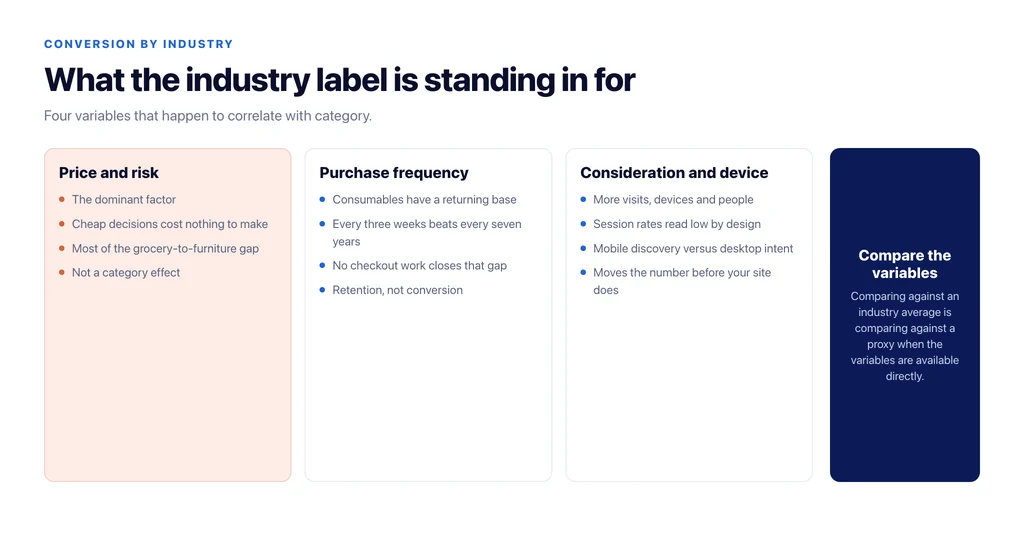
What the industry label is standing in for
Price and risk. The dominant factor. Cheap, low-risk items convert at multiples of expensive ones because the decision costs almost nothing. Most of the gap between a grocery store and a furniture store is this, not the category.
Purchase frequency. Consumables have a returning-customer base that converts several times better than first-time discovery traffic. A category where people buy every three weeks will always beat one where they buy every seven years, and no amount of checkout work closes that gap.
Consideration length. How many visits, devices and people are involved before purchase. Long consideration spreads conversion across sessions, so session-based rates read low.
Device and channel mix. Categories differ systematically in how much of their traffic is mobile discovery versus desktop intent, and that alone moves the rate before anything on the site matters.
An industry average is a rough proxy for those four variables. Comparing yourself against it is comparing against a proxy when you could compare against the variables directly.
Where industry does genuinely matter
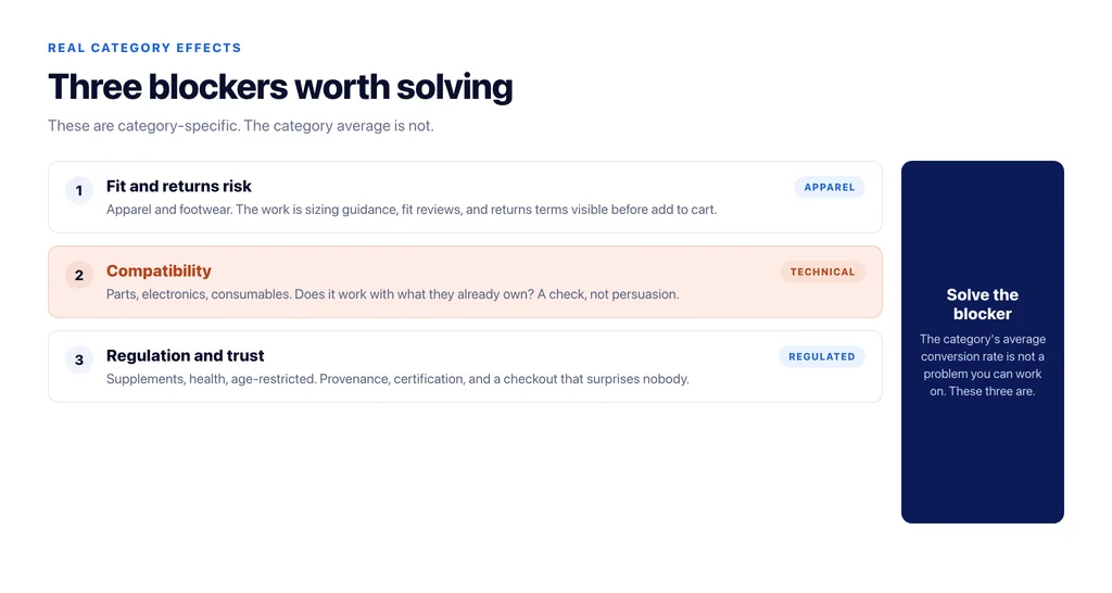
Three real category effects are worth knowing, because they change what you should work on.
Fit and returns risk. In apparel and footwear, uncertainty about fit is the primary conversion blocker, and the work is sizing guidance, fit reviews and a returns policy visible before the add to cart.
Compatibility. In parts, electronics and consumables, the blocker is whether it works with what the shopper already owns. The work is a compatibility check on the product page, not persuasion.
Regulation and trust. In supplements, health goods and anything age-restricted, the blocker is credibility and compliance, and the work is provenance, certification and a checkout that does not surprise anyone.
Those are category-specific problems worth solving. The category’s average conversion rate is not a problem worth solving.
Build a comparable set instead
Five attributes are enough to define a set of stores genuinely comparable to yours: price band, purchase frequency, consideration length, mobile share, and market. Write down where your store sits on each.
Then compare against your own segments that share those attributes, rather than against outside stores you cannot see the internals of. Your returning-customer desktop traffic is a valid comparison for your returning-customer mobile traffic. Your low-price consumable category is a valid comparison for your other low-price consumable category.
The result is a table you can act on: which of your own segments is under its own comparable, by how much, and what changes for that segment specifically.
Segment your own catalogue the same way
Most stores contain several industries. A furniture retailer sells beds and it sells cushions; a bike shop sells frames and it sells inner tubes. Blending them produces an average conversion rate that describes nothing in the catalogue.
Split the catalogue into price and frequency bands and measure each one. This is where the useful findings live: the low-price repeat lines carrying the account, the high-price lines whose traffic is mostly research, and the middle band where a small conversion gain is worth more than anything else you could do.
Then measure revenue per session per band, because the high-price band will always look worse on conversion and often better on revenue — which is the whole point of measuring both. The definitional groundwork for that is in what is a good conversion rate for ecommerce.
Reading a published industry table without being misled
If you use one anyway, three questions make it safe. Which population — platform customers, analytics customers, or a survey panel? Which denominator — sessions, users or product views? Which aggregation — mean, median or weighted?
Then treat the figure as an order of magnitude, not a target. The methodology behind these numbers is discussed further in ecommerce conversion rate benchmarks.
What to do with a category that converts badly and earns well
This is the case industry tables cannot handle, and most catalogues have one: a range with a poor conversion rate that contributes a large share of revenue.
Do not optimise it toward the conversion rate of the cheap ranges. It will not get there, because the decision genuinely takes longer, and the changes that would move it — discounting, removing options, simplifying the range — usually reduce revenue.
Measure it on the metrics that fit a long decision instead: assisted revenue, returning-visitor conversion, and revenue per session. Then work on the things that shorten a long decision rather than the things that shorten a short one: comparison content, specification clarity, delivery certainty, and a route to a human for the questions a page cannot answer.
The reverse case is worth naming too. A range that converts well and earns little is often absorbing attention out of proportion to its value, because the dashboard rewards it. Revenue per session is what exposes that, and it is why the two metrics belong side by side.
The checklist
- Write down your store’s price band, purchase frequency, consideration length, mobile share and market.
- Stop comparing against industry averages that do not match those five.
- Split your own catalogue into price and frequency bands.
- Measure conversion and revenue per session for each band.
- Identify the category-specific blocker — fit, compatibility or trust — and work on that.
- Compare segments against your own comparable segments, not outside stores.
- When quoting an external table, state its population, denominator and aggregation.
Sources
- Measure ecommerce (GA4) — Google for Developers
- Cart abandonment rate statistics — Baymard Institute
- SEO best practices for ecommerce sites — Google Search Central
- About Analytics sessions — Google Analytics Help
Frequently Asked Questions
Want this run against your store? Book a call with The Reach Bureau.