# Ecommerce Category Page Design: Layout Decisions That Sell
Category design gets discussed as aesthetics and decided by taste, which is why the same mistakes appear on stores that spent a lot on design. The decisions that matter are mechanical: how many products a shopper can compare at once, how quickly they can narrow, and what the layout does under a thumb.
Six decisions carry most of the outcome.
Grid density: comparison beats size
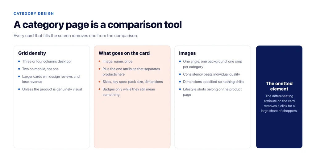
Larger product cards look better in a design review and usually perform worse, because a category page is a comparison tool. A shopper wants several products in view at once, and every card that fills the screen removes one from the comparison.
Practical range: three or four columns on desktop for most catalogues, two on mobile. One-column mobile grids feel generous and turn browsing into scrolling, which is why the shopper stops before reaching the product that would have converted.
Where the products are genuinely visual — art, furniture in a room, apparel on a body — a larger card earns its space. Where the decision is specification-led, it does not.
What goes on the card
Four elements do work: image, name, price, and the one attribute that separates products in this category. Everything else competes with them.
That fourth element is the decision most stores skip. In apparel it is available sizes; in electronics a key specification; in consumables the pack size; in furniture the dimensions. Putting it on the card removes a click for a large share of shoppers.
Badges — sale, new, bestseller — work in small numbers and stop working when every card has one.
Filters where the hand is
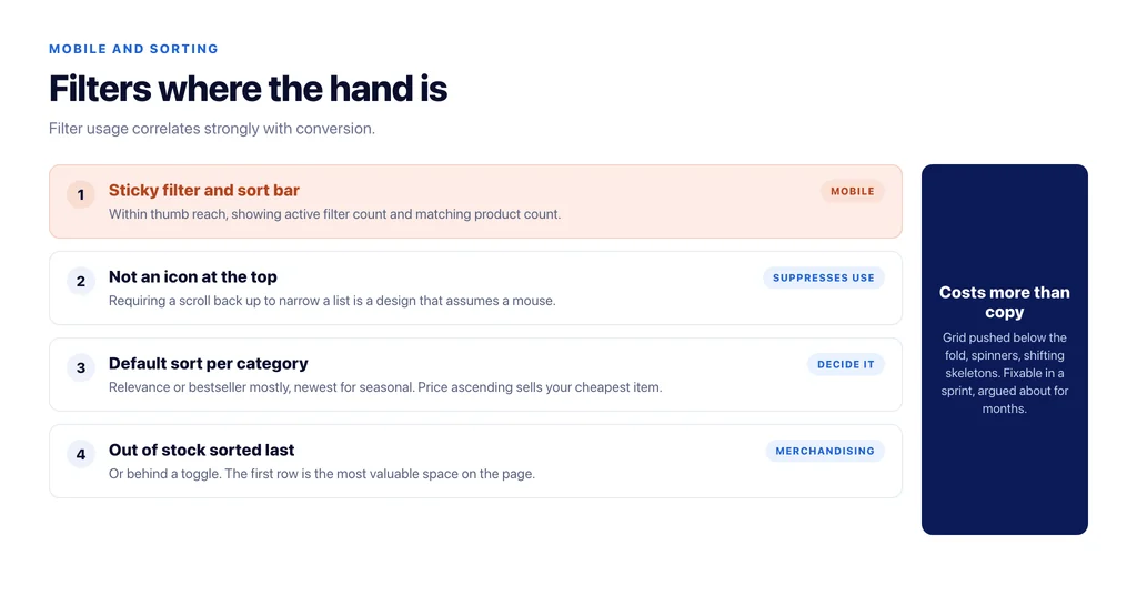
On desktop, a left rail is conventional and fine. On mobile, filters hidden behind a single icon at the top get used by a fraction of visitors, and filter usage correlates strongly with conversion.
The pattern that works on mobile: a sticky filter and sort bar within thumb reach, showing the count of active filters and the number of matching products, with results updating without a full page reload. Anything that requires scrolling back to the top to narrow a list is a design that assumes a mouse.
Sorting defaults, chosen deliberately
The default sort is a merchandising decision disguised as a technical one, and on many stores it is whatever the platform shipped.
Relevance or bestseller first suits most categories. Newest first suits fashion and anything seasonal. Price ascending trains shoppers to buy your cheapest item and is rarely what you want as a default, however popular the option is as a choice.
Out-of-stock products should sort last or be hidden behind a toggle rather than sitting in the first row where they absorb the attention that the first row earns.
Images that compare
Consistency matters more than quality here. Mixed backgrounds, mixed crops and mixed angles make a grid hard to scan, and a hard-to-scan grid loses shoppers regardless of how good each individual photograph is.
One angle, one background, one crop ratio across a category, with lifestyle shots reserved for the product page. Specify dimensions on every image so the grid does not shift as it loads, which is both a Core Web Vitals issue and the reason a shopper taps the wrong product.
What the page must not do
Push products below the fold on mobile with a banner or a paragraph of introduction. Load the grid with a spinner while a full-page skeleton shifts. Reveal the filter count only after the results load. Change layout between the first and second screen of results.
Each of these is common, each is fixable in a sprint, and each costs more than the copy decisions people spend longer arguing about. The content side of the page is covered in ecommerce category page best practices.
Testing it without a research budget
Category layout decisions are easy to argue about and cheap to settle, provided you use the traffic you already have.
The two measures that answer most questions: click-through from the grid into products, and add-to-cart rate for sessions that entered on the category. Both are available without new tooling, and both respond within a fortnight on a category with reasonable traffic.
Change one thing at a time on a category with enough volume to read, and keep the sibling categories as an informal control. Grid density, the fourth element on the card, the default sort and the mobile filter placement are all worth a single test each.
Two habits make the results trustworthy. Run for a full two weeks so you cover weekday and weekend behaviour, and check the mobile numbers separately, because a change that helps desktop shoppers and hurts thumb reach will look neutral in the blended figure and cost you money.
The checklist
- Three or four columns desktop, two mobile, unless the product is genuinely visual.
- Card carries image, name, price, and the one differentiating attribute for that category.
- Badges used sparingly enough to mean something.
- Sticky filter and sort within thumb reach on mobile, with counts shown.
- Default sort chosen per category, not inherited from the platform.
- Out-of-stock products sorted last or toggled off.
- Consistent image treatment across a category, with dimensions specified.
- Grid above the fold on mobile, no layout shift as it loads.
Sources
- Cumulative Layout Shift (CLS) — web.dev
- Largest Contentful Paint (LCP) — web.dev
- SEO best practices for ecommerce sites — Google Search Central
- Configuring WooCommerce settings — WooCommerce
Frequently Asked Questions
Want this run against your store? Book a call with The Reach Bureau.