A comparison page has an awkward property: it only works if the reader believes you might recommend against your own product. The moment every comparison concludes with your bestseller, the page stops persuading anyone and becomes a slightly annoying product listing.
That constraint is the whole design problem. Everything below follows from it — including why comparison pages are unusually well suited to AI search, and unusually easy to ruin.
Which comparisons to build
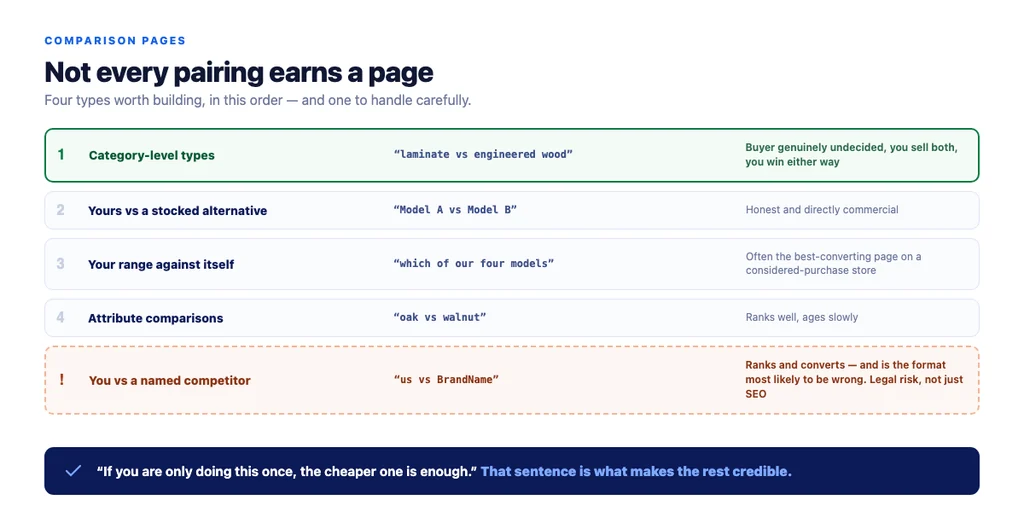
Not every pairing. Four types earn a page, in this order.
1. Category-level type comparisons. "Type A versus type B" where both are things you sell. The highest-value comparison because the buyer is genuinely undecided and you win either way. Build this first.
2. Your product versus a specific alternative you also stock. Straightforward, honest, and directly commercial.
3. Your range against itself. "Which of our four models" is a real question and a real page — often the single best-converting page on a considered-purchase store.
4. Attribute comparisons. "Material X versus material Y" across a category. Useful, ranks well, ages slowly.
And one to be careful with: you versus a named competitor. It ranks, it converts, and it is the format most likely to be inaccurate — which is a legal and reputational risk, not just an SEO one. If you build it, base every claim on published specifications, date the page, and be prepared to update it when they change.
Structure that works
The order matters more than the content, because a comparison reader is scanning for a verdict and then working backwards.
1. The verdict, up front. "Choose A if X, choose B if Y." Two sentences. Nobody wants to read 1,200 words before finding out. 2. A real comparison table. The three to five attributes that actually decide it, not fifteen that pad it out. 3. When each one wins. Concrete situations, not adjectives. 4. The trade-off stated plainly. Every genuine comparison has one. If yours does not, one option is worse and you should say so. 5. What they have in common — so the reader knows which differences do not matter. 6. Cost of being wrong. Returns, refitting, the cost of upgrading later. This is where a considered-purchase buyer actually decides. 7. Both products, buyable. Not one call to action for your preferred item.
Staying honest and still selling
This is the part that feels contradictory and is not.
- Recommend against yourself sometimes. "If you are only doing this once, the cheaper one is enough." This sentence sells more than any superlative, because it makes everything else on the page credible.
- State the trade-off in your product's own terms. Heavier, dearer, slower to install. Buyers already know nothing is perfect.
- Use your own testing and returns data, which is the part a competitor cannot copy.
- Let the table decide, not the copy. If the attributes point one way, the reader will get there without being pushed.
- Do not compare against a straw man. Choosing a weak alternative to beat is transparent.
- Date it, and keep it current. A comparison referencing a superseded model is worse than no comparison.
Why comparison pages suit AI search
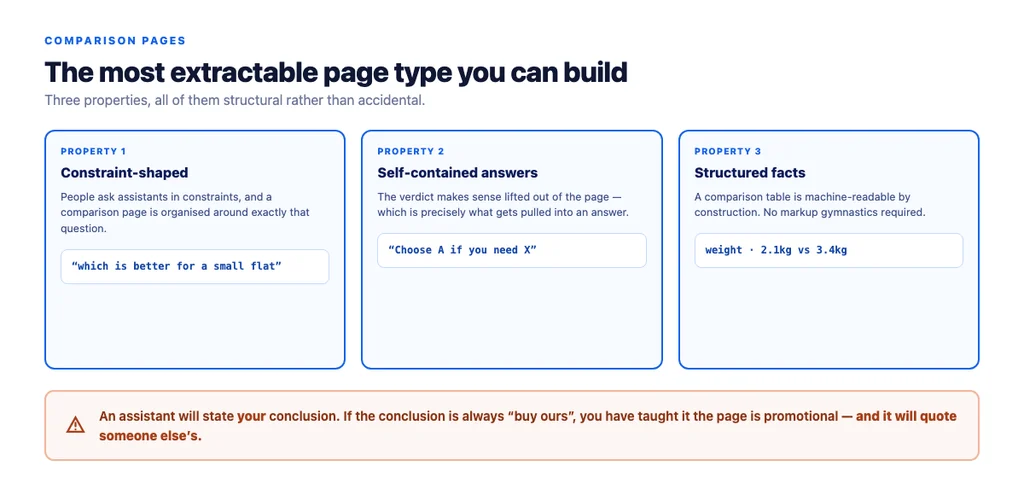
They are the page type most likely to be extracted, for three reasons.
They are constraint-shaped. "Which is better for a small flat" is exactly how people ask assistants, and a comparison page is organised around that question.
They have self-contained answers. "Choose A if you need X" makes sense lifted out of context — which is precisely what gets pulled.
They contain structured facts. A comparison table is machine-readable by construction.
The corollary: an assistant summarising your comparison will state your conclusion. If the conclusion is "always buy ours", you have taught it that the page is promotional, and it will use someone else's.
Technical requirements
- Indexable, with a self-referencing canonical. Comparison pages built by a plugin sometimes inherit odd canonicals.
- One comparison per URL. A page comparing six things ranks for nothing.
- Stable URL. These pages accumulate links; do not regenerate them with new slugs.
ItemListstructured data for the products compared, plusBreadcrumbList.Productdata on the product pages, not duplicated here.- No FAQPage expectation. Google restricted FAQ rich results to government and health sites in 2023 and has since wound the feature down; keep structured answers for other systems, not for a bigger snippet.
- Table readable on mobile — horizontally scrollable in its own container, not squeezed to unreadability.
- Both products linked with their own anchors, so internal linking does not favour one.
Measuring them
- Organic entrances, since these pages target genuine demand.
- Assisted conversions, because a comparison is usually mid-path rather than last-click.
- Onward click rate to both products — if one gets 95% of clicks, the comparison is not doing its job.
- Return rate on products bought after visiting. A good comparison lowers it, which is the strongest commercial argument for the format.
- Whether an assistant quotes your verdict when asked the underlying question.
The checklist
- Category-level type comparison built first
- Own-range comparison built for considered purchases
- Competitor comparisons based only on published specifications
- Verdict in the first two sentences
- Table limited to the three to five deciding attributes
- Concrete situations, not adjectives
- Trade-off stated plainly, including for your own product
- Commonalities stated so irrelevant differences are dismissed
- Cost of being wrong covered
- Both products buyable from the page
- At least one honest recommendation against your own product
- Page dated and reviewed when models change
- Indexable with a self-referencing canonical
- One comparison per URL, stable slug
ItemListandBreadcrumbListpresent- Table scrollable on mobile
- Onward clicks to both products monitored
- Return rate tracked for purchases following a comparison visit
Sources
- SEO Best Practices for Ecommerce Sites — Google Search Central
- Intro to Product Structured Data on Google — Google Search Central
- Creating Helpful, Reliable, People-First Content — Google Search Central
- Consolidate Duplicate URLs with Canonicals — Google Search Central
- Google Search Essentials — Google Search Central
Frequently Asked Questions
Want this run against your store? Book a call with The Reach Bureau.