Ranking well and converting badly is a specific problem with a specific cause, and it is almost never "the page needs a better CTA."
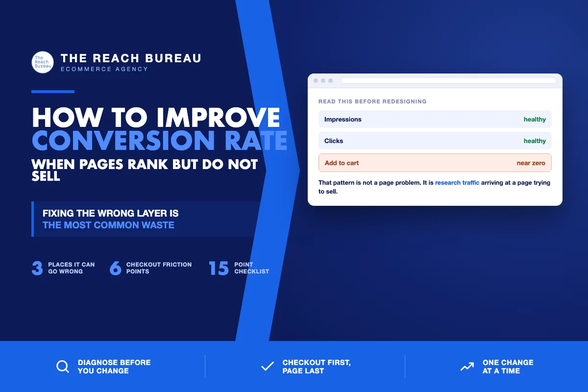
The situation looks like this: a page holds a decent position, brings steady traffic, and produces almost nothing. The instinct is to redesign it. The redesign usually changes nothing, because the problem was upstream — the page is attracting people who were never going to buy from it.
There are three places a conversion problem can live. Fixing the wrong one is the most common waste in ecommerce optimisation, so the diagnostic comes first.
The three-way diagnostic
Run this before touching anything.
Open Search Console for the page and read the query list. Then ask three questions in order.
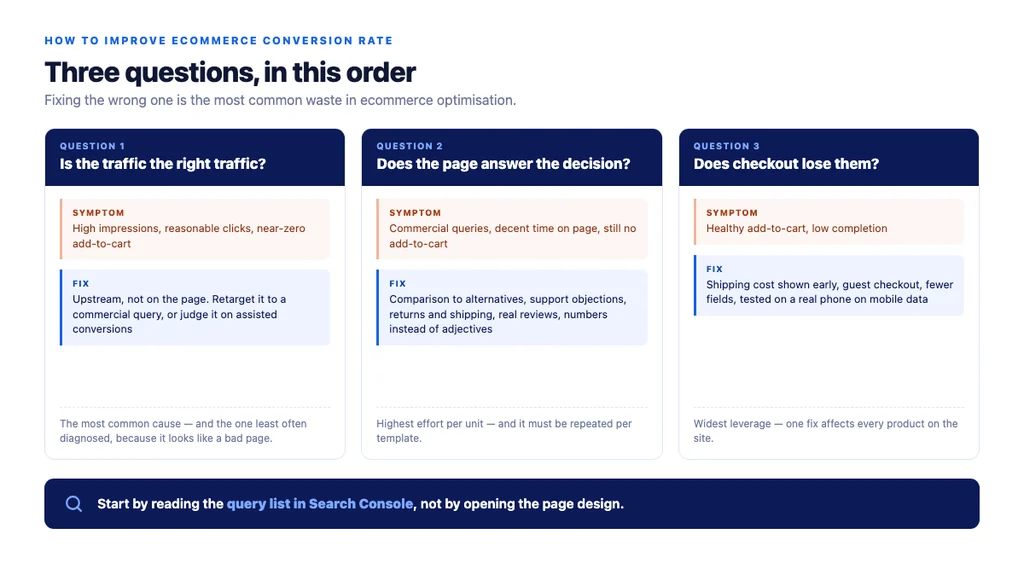
Question 1: is the traffic the right traffic?
Look at what the page actually ranks for. If the queries are informational — "how does X work," "what is Y" — while the page is trying to sell, the visitor is not shopping yet. No amount of CTA work converts research intent.
The symptom: high impressions, reasonable clicks, near-zero add-to-cart.
The fix is upstream, not on the page. Either retarget the page to a commercial query, or accept it as top-of-funnel and judge it on assisted conversions and the traffic it passes to your commercial pages.
This is the most common cause and the one least often diagnosed, because it does not look like a conversion problem — it looks like a bad page.
Question 2: does the page answer the buying decision?
If the traffic *is* commercial and still does not convert, the page is failing to close.
The symptom: commercial queries, decent time on page, no add-to-cart.
The usual gaps, in order of frequency:
- No comparison to alternatives. Shoppers arrive comparing three products; a page that describes only itself leaves them to compare elsewhere.
- Unanswered objections. Sizing, compatibility, care, durability. Your support inbox is the list.
- No returns or shipping information anywhere near the decision. These two facts stop more purchases than price does.
- No social proof. Zero reviews on a considered purchase is a stopping point.
- Missing specifics. Adjectives where numbers should be. "Premium water resistance" versus "IPX7, tested at one metre for thirty minutes."
Question 3: does the checkout lose them?
If people add to cart and disappear, the page is fine and the problem is downstream.
The symptom: healthy add-to-cart, low completion.
Where it usually goes wrong:
| Friction point | Fix |
|---|---|
| Surprise shipping cost at the final step | Show it early, or on the product page |
| Forced account creation | Offer guest checkout |
| Too many form fields | Ask only for what you need to ship and charge |
| No visible progress | Show steps remaining |
| Payment method missing | Add the ones your market expects |
| Slow or unstable checkout on mobile | Test it on a real phone, on mobile data |
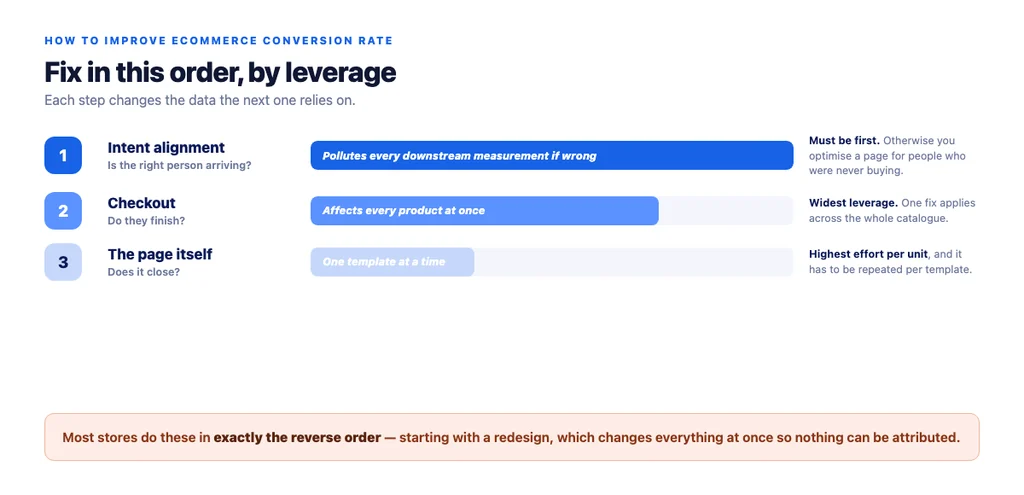
Fix in this order
Not because it is tidiest, but because each step changes the data the next one relies on.
1. Intent alignment. If the wrong people arrive, every downstream measurement is polluted. 2. Checkout. It affects every product on the site at once, so it has the widest leverage per fix. 3. The page itself. Highest effort per unit, and the only one that has to be repeated per template.
Most stores do these in exactly the reverse order.
Measuring it honestly
- Segment by landing page, not site-wide. A site-wide conversion rate is a blend that hides which pages are the problem.
- Segment by device. Mobile and desktop conversion rates differ enough that a blended figure misleads on both.
- Use assisted conversions for informational pages. Judging a buying guide on last-click makes it look worthless and gets it cut.
- Change one thing at a time. Two simultaneous changes means one result and no attribution.
- Wait for real volume. A 20% lift on 40 sessions is noise. Decide your minimum before you look, so the result does not decide it for you.
What not to start with
- A redesign. Expensive, slow, and it changes everything at once so you learn nothing.
- Adding urgency banners. They move a small number and cost trust with the rest.
- Copying a competitor's layout. Their traffic has different intent; the layout is not what makes it convert.
- Chasing an industry benchmark. Your own trend line is the only honest comparison — benchmarks blend categories, price points and traffic mixes that have nothing to do with yours.
The checklist
- Search Console query list read for the underperforming page
- Traffic classified: informational or commercial intent
- Informational pages judged on assisted conversions, not last click
- Add-to-cart rate checked separately from purchase completion
- Comparison to alternatives present on the page
- Support-inbox objections answered on the page
- Returns and shipping visible near the decision
- Real reviews present on considered purchases
- Specific figures instead of adjectives
- Shipping cost shown before the final checkout step
- Guest checkout available
- Form fields reduced to what is needed to ship and charge
- Checkout tested on a real phone on mobile data
- Conversion segmented by landing page and by device
- One change at a time, with a minimum sample decided in advance
Sources
- Creating Helpful, Reliable, People-First Content — Google Search Central
- SEO Best Practices for Ecommerce Sites — Google Search Central
- Ecommerce Product Data and Content on Google — Google Search Central
- Intro to Product Structured Data on Google — Google Search Central
- Merchant Return Policy Structured Data — Google Search Central
Frequently Asked Questions
Want this run against your store? Book a call with The Reach Bureau.