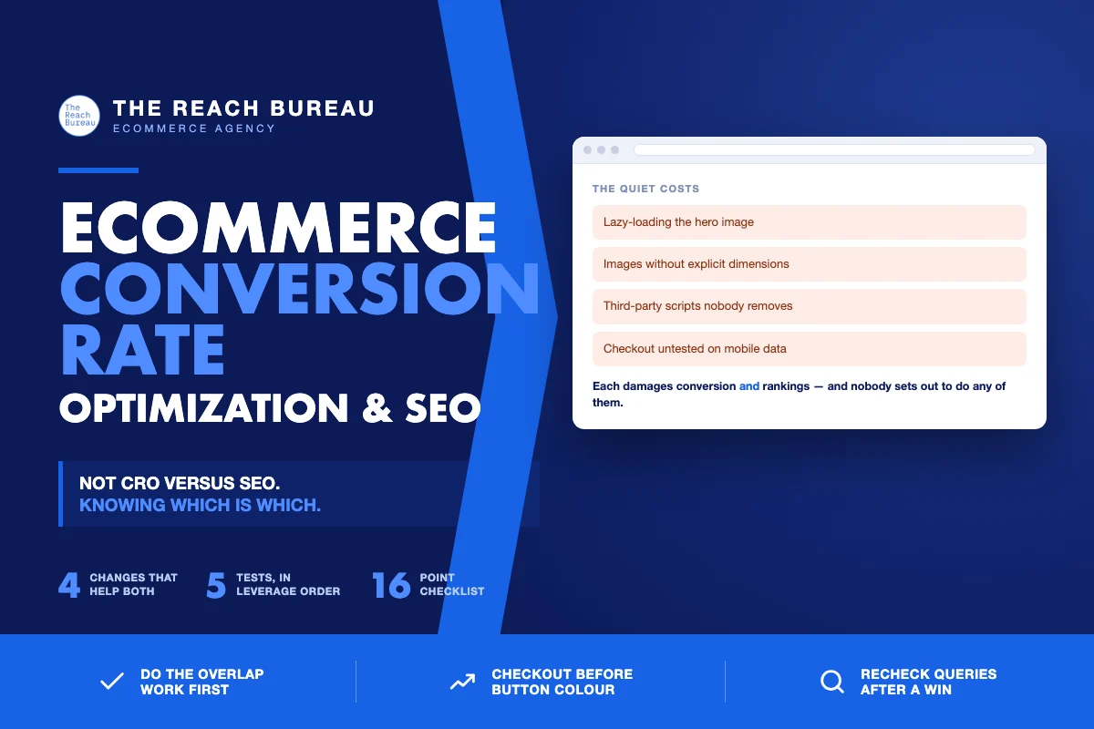
Conversion optimisation and SEO are usually run by different people with different dashboards, which is how stores end up shipping changes that help one and quietly damage the other.
A pop-up that lifts email capture also delays the largest content element. A "cleaner" product page converts better in a test and drops out of results because the removed copy was what ranked it. An infinite-scroll grid feels better and makes half the catalogue undiscoverable.
The useful frame is not "CRO versus SEO." It is that a specific set of changes improves both, a smaller set trades one for the other, and knowing which is which saves a lot of arguing.
Where they genuinely overlap
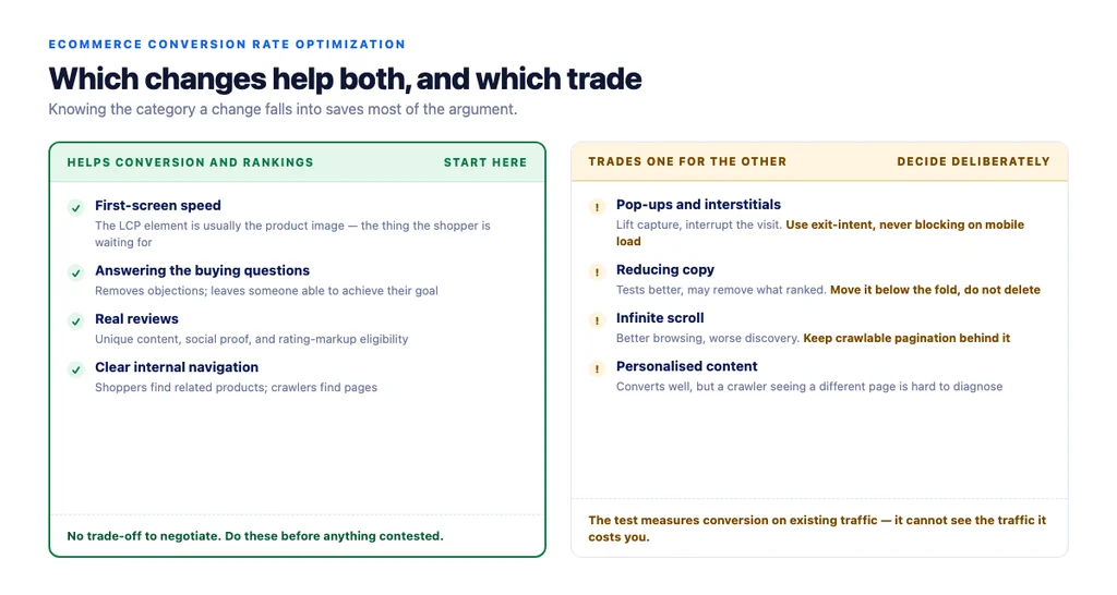
These are the changes that help conversion and rankings at the same time. Start here, because there is no trade-off to negotiate.
Speed, specifically on the first screen. Faster pages convert better and Core Web Vitals is a documented ranking consideration. The overlap is exact: the Largest Contentful Paint element is usually the product image, which is also the thing a shopper is waiting for.
Answering the buying questions on the page. Sizing, materials, compatibility, returns. It removes purchase objections and it is what Google's guidance on creating helpful, reliable, people-first content describes as leaving someone able to achieve their goal.
Real reviews. Unique content that ranks, social proof that converts, and eligibility for rating markup.
Clear internal navigation. Shoppers find related products; crawlers find pages and understand relationships.
Mobile usability. Most ecommerce traffic is mobile, and a checkout nobody tested on a phone loses both the sale and the engagement signals.
Where they trade off — and how to decide
Pop-ups and interstitials. They lift capture rates and they interrupt. The workable compromise is exit-intent or scroll-triggered rather than immediate, and never covering the main content on mobile at first load.
Reducing copy. Shorter pages often test better. If the removed copy is what earned the ranking, the test wins and the traffic leaves. Move copy below the fold rather than deleting it — that usually satisfies both.
Infinite scroll. Better browsing, worse discoverability. Keep crawlable paginated URLs behind it.
Aggressive image compression. Faster, but a product image that misrepresents colour or texture drives returns. Optimise format and sizing before quality.
Personalised or dynamic content. Converts well, but if the crawler receives a different page than users do, you have a problem that is hard to diagnose. Keep the core content stable.
What to test first
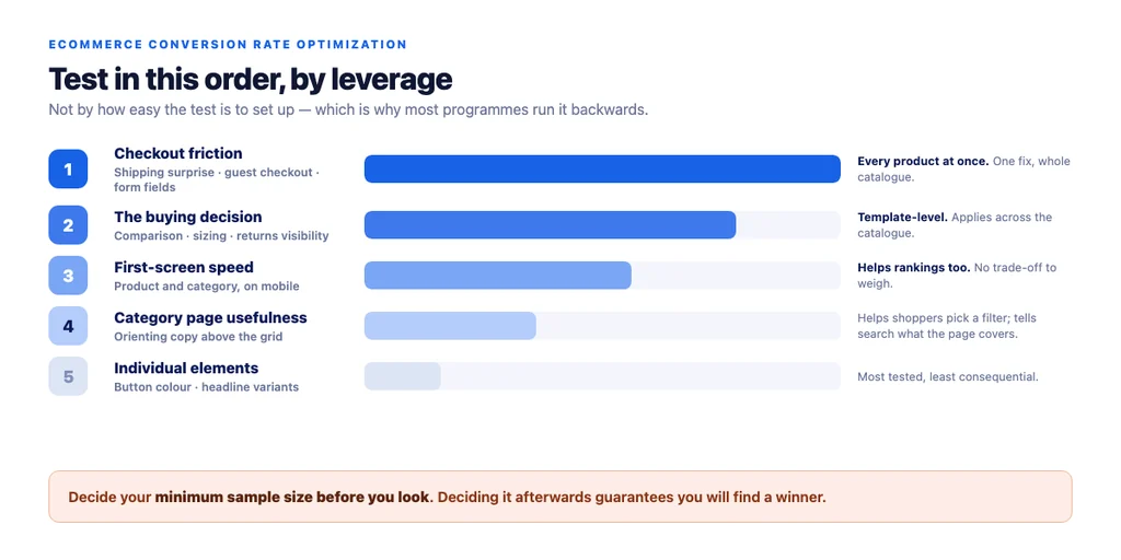
Ordered by leverage rather than ease.
1. Checkout friction. One fix applies to every product on the site. Surprise shipping costs at the final step, forced account creation, and excessive form fields are the standard three. 2. The buying decision on product pages. Comparison to adjacent models, sizing, returns visibility. Template-level, so it applies across the catalogue. 3. First-screen speed on the templates that carry traffic. Category and product, on mobile. 4. Category page usefulness. Two or three orienting sentences above the grid help shoppers choose a filter and tell a search engine what the page covers. 5. Individual page elements. Button colours and headline variants last. They are the most tested and the least consequential.
Most programmes run this list backwards, because item five is the easiest to set up.
Measuring without fooling yourself
- Segment by landing page and device. A blended conversion rate hides which template is the problem and misleads on both mobile and desktop.
- Watch rankings during CRO tests. If a winning variant removed content, check the query list for that page two weeks later.
- Decide the sample size before you look. A 20% lift on 40 sessions is noise, and deciding the threshold afterwards guarantees you will find a winner.
- One change at a time on the same template. Two changes, one result, no attribution.
- Use assisted conversions where content sits early in the path. Last-click attribution makes guides and category pages look worthless.
The quiet costs
Things that damage both, and that nobody sets out to do:
- Lazy-loading the hero image. Damages LCP and delays the thing the shopper came for.
- Layout shift from images without dimensions. Frustrating to use and a measured metric.
- Third-party scripts added over time. Each one costs speed; almost nobody removes them.
- Copy replaced by designed images. Invisible to crawlers, unselectable for users.
- Checkout untested on mobile data. Works on office wifi, fails on a train.
The checklist
- First-screen speed measured on mobile for product and category templates
- Hero and first-row images not lazy-loaded
- Images have explicit dimensions
- Third-party scripts audited and unused ones removed
- Buying questions answered on the product page
- Comparison to adjacent models present
- Returns and shipping visible near the decision
- Real reviews collected and displayed
- Pop-ups exit-intent or scroll-triggered, never blocking on mobile load
- Copy moved rather than deleted when simplifying
- Paginated URLs retained behind any infinite scroll
- Crawler receives the same core content as users
- Checkout tested on a real phone on mobile data
- Conversion segmented by landing page and device
- Sample size decided before looking at results
- Query list re-checked two weeks after any content-reducing win
Sources
- Creating Helpful, Reliable, People-First Content — Google Search Central
- SEO Best Practices for Ecommerce Sites — Google Search Central
- Google Search Essentials — Google Search Central
- Intro to Product Structured Data on Google — Google Search Central
- Merchant Return Policy Structured Data — Google Search Central
Frequently Asked Questions
Want this run against your store? Book a call with The Reach Bureau.